🏖️Back From Vacation ☀️

Modern Web Weekly #33
Invokers get a new syntax and support in Safari 🎉
In case you missed it, invokers enable you to declaratively attach behavior to HTML elements without adding event listeners. This means that you can let a button open a dialog for example without having to attach a click event handler.
A similar mechanism already exists for popovers where you can attach the popovertarget and popovertargetaction to a button to make it control the showing and hiding of a popover, but invokers extend this to many more elements.
The syntax for invokers has now been changed to use the more descriptive command and commandfor attributes and is currently supported in Chrome Canary and Safari Tech Preview 201. In Chrome Canary you'll need to enable "experimental web features" at chrome://flags and in Safari Tech Preview you'll need to enable the "HTML command and commandfor attributes" by choosing "Feature flags" in the "Develop" menu.
After that, you can declaratively let a button show a popover like this:
<button
  commandfor="popover"
  command="showPopover">Show popover</button>

<div id="popover" popover>This is a popover</div>
In this example, the commandfor attribute contains the id of the popover element and commandfor contains the action, which is to show the popover.
Again, this is already possible with popovertarget and popovertargetaction but with these attributes, you can do much more, for example, open and close a <dialog>:
<button
  commandfor="dialog"
  command="showModal">Show dialog</button>

<dialog id="dialog">
  <p>This is a dialog</p>

  <button commandfor="dialog" command="close">
    Close
  </button>
</dialog>
When clicked, the <button> shows a modal dialog through the "showModal" command and the <dialog> itself contains a <button> that closes it through the "close" command.
Keep in mind that these invokers are still experimental and actually just a proposal by the OpenUI collective. You can find their explainer here. The explainer contains many more examples of invokers that may be implemented by browsers in the future.
Custom commands
In addition to the predefined commands, you can also define custom commands by setting a command event handler on the element that the commands are invoked on, not on the buttons that dispatch the commands. This is a really nice feature because it enables you to set a single event handler on the receiver of the command, so you don't have to set an event handler on each button that dispatches a command.
Here's an example of an <output> element that contains a number and two buttons to increment and decrement that value:
<button
  commandfor="counter"
  command="decrement-value">-1</button>

<button
  commandfor="counter"
  command="increment-value">+1</button>

<output id="counter">1</output>
Note that custom commands need to contain a "-" to avoid name collisions with existing, predefined commands.
To make this work, we attach a single event handler for the command event to the <output> element and inspect the command property of the event to determine which command to invoke:
const counter = document.querySelector('#counter');

counter.addEventListener('command', ({command}) => {
  if(command === 'decrement-value') {
    counter.value = parseInt(counter.value) - 1;
  }
  if(command === 'increment-value') {
    counter.value = parseInt(counter.value) + 1;
  }
});
Here's a codepen that shows all the examples:
Note that the <details> demo doesn't work (yet) in Safari Tech Preview.
All chapters of Mastering Web Components are now available separately 🎉
I decided to offer all chapters in the paid version of my course Mastering Web Components separately as well.
So if you don't want or need each chapter of the paid version, you can now pick the ones you want!
The price for each chapter is only $10 and some are even just $5.
Get the course here! 👇

Mastering Web Components
Mastering Web Components is a course that will take you from beginner to expert in Web Components by teaching you how can create your own reusable Web Components and integrate them into any web app.
In the full, paid version of the course, you will build an image gallery component to apply and test your knowledge of the concepts you have learned.
The course contains many interactive code examples you can study and modify to test and sharpen your skills.
In the free version, you will learn:
- how to create and register a Web Component
- how to effectively use the lifecycle methods of Web Components
- how to encapsulate the HTML and CSS of your Web Component using Shadow DOM
- how to extend native HTML elements
- how to compose Web Components with user-defined content
- how to test Web Components
You get:
- 107 page PDF
- 22 interactive code examples
The full version includes everything from the free version and you will also learn:
- how to theme and share styling between Web Components
- how to integrate Web Components into forms and validate them
- how to server-side render Web Components
- how to implement data-binding for Web Components
- how to compose Web Components using the mixin pattern
- how to build Web Components with a library
You get:
- 257 page PDF
- 45+ interactive code examples
How you can animate flex properties with view transitions
Imagine you would like to switch the horizontal layout of elements in a flex container to a vertical layout. You can easily do this by changing the value of the flex-direction property from row to column.
Unfortunately, flex-direction can't be animated by default with CSS, but we can use view transitions to animate it anyway.
When view transitions are applied to an HTML document, a pseudo-element tree is added to the page to transition the view and it looks like this:
::view-transition
└─ ::view-transition-group(root)
   └─ ::view-transition-image-pair(root)
      ├─ ::view-transition-old(root)
      └─ ::view-transition-new(root)
View transition pseudo-element tree
The ::view-transition-group pseudo-element transitions the differences between size and position in the old and new view for any element that has a view-transition-name property. This means that if you have an element with the same view-transition-name in both views and that element is in a different position in the new view, the browser will animate it from the old position to the new one.
The best part is that the browser does this by default: you only need to give the element a view-transition-name property and the browser will take care of the animation.
So to animate the change of flex-direction from row to column we need to give each element a unique view-transition-name and then we need to wrap the code that changes the value of flex-direction in a call to document.startViewTransition().
Here's the HTML:
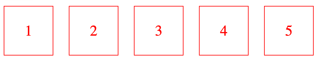
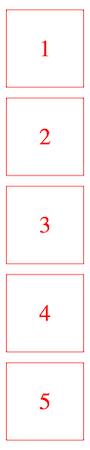
<div class="container">
  <div class="item" style="view-transition-name: item1">1</div>
  <div class="item" style="view-transition-name: item2">2</div>
  <div class="item" style="view-transition-name: item3">3</div>
  <div class="item" style="view-transition-name: item4">4</div>
  <div class="item" style="view-transition-name: item5">5</div>
</div>
And here's the relevant CSS:
.container {
  display: flex;
  justify-content: space-between;
  width: 500px;
  gap: 10px;
}

.container.toggle {
  flex-direction: column;
}
When the flex container with class "container" gets the class "toggle", its flex-direction property will change from row to column. Note that the default value for flex-direction is row so we don't need to specify it.
If we would just apply the class "toggle", the change would be immediate but if we wrap the class change in document.startViewTransition it will be animated:
const button = document.querySelector('button');
const container = document.querySelector('.container');

button.addEventListener('click', () => {
  document.startViewTransition(() => {
    container.classList.toggle('toggle');
  })
});
Here's the result:
Animate flex-direction with view transition
Now we can also customize this animation by adding some delay. To do this, we add an animation-delay to the ::view-transition-group pseudo-element of each HTML element:
::view-transition-group(item1) {
  animation-delay: 150ms;
}
::view-transition-group(item2) {
  animation-delay: 300ms;
}
::view-transition-group(item3) {
  animation-delay: 450ms;
}
::view-transition-group(item4) {
  animation-delay: 600ms;
}
::view-transition-group(item5) {
  animation-delay: 750ms;
}
Here's what the result looks like:
Animate flex-direction with view transition and a delay on each item
In the same way, we can also animate justify-content which aligns the elements along the horizontal axis. When the value of justify-content is flex-start the elements are aligned to the left and when the value is flex-end the elements are aligned to the right.
Here's the relevant CSS:
.container {
  display: flex;
  justify-content: flex-start;
  width: 500px;
  gap: 10px;
}

.container.toggle {
  justify-content: flex-end;
}
And here's the result:
Animate justify-content with view transitions
Let's also customize this animation by adding some delay to the animation of the individual elements. This will be a bit more complex because now we need to adjust the animation based on the direction the elements are moving in.
First, let's look at the result:
Animate justify-content with view transitions and a small delay
You can see in the video that the animation is different depending on the direction the elements are moving in. When justify-content is set to flex-end, the elements move to the right with a delay, starting with element 5, then 4, then 3 etc.
When justify-content is set to flex-start, the elements move to the left with a delay, starting with element 1, then 2, then 3 etc.
We can customize the animations for both directions based on whether or not the element .container has the "toggle" class. If it has this class then the elements are moving to the right starting with element 5. Let's look at the CSS:
:root {
  --base-duration: 300ms;
  --duration-diff: 75ms;
}

/* animation delays when justify-content is animated from flex-start to flex-end */
  html:has(.toggle):has(#delay:checked) {
    &::view-transition-group(item1) {
      animation-duration: var(--base-duration);
      animation-delay: calc(4 * var(--duration-diff));
    }
    &::view-transition-group(item2) {
      animation-duration: var(--base-duration);
      animation-delay: calc(3 * var(--duration-diff));
    }
    &::view-transition-group(item3) {
      animation-duration: var(--base-duration);
      animation-delay: calc(2 * var(--duration-diff));
    }
    &::view-transition-group(item4) {
      animation-duration: var(--base-duration);
      animation-delay: var(--duration-diff);
    }
    &::view-transition-group(item5) {
      animation-duration: var(--base-duration);
    }
  }
We nest all the CSS styles in a block that has the selector:
html:has(.toggle):has(#delay:checked) {...}This targets the <html> element when it has an element with class "toggle" and it also has a radiobutton element with id "delay" that is checked. This makes sure the styles inside this block only apply when the container element has the class toggle and the radiobutton to apply the delay is checked.
We see here that we don't apply a delay to item5 since this is the first element to be moved. After that, item4 needs to be moved which gets a delay with animation-delay: var(--duration-diff); which is equal to 75ms.
After that, item3 is moved which gets a delay of 150ms with animation-delay: calc(2 * var(--duration-diff));, then item2 with a delay of 225ms with animation-delay: calc(3 * var(--duration-diff));, etc.
We also apply animation-duration: var(--base-duration); to all elements so the animation takes a bit longer, making it a bit better to look at.
When we go back in the other direction by setting justify-content to flex-start, we need to reverse the delay so the animation starts with item1, then item2, then item3 etc.
In this case, we nest all the CSS styles in a block that has this selector:
html:not(:has(.toggle)):has(#delay:checked) {...}This targets the <html> element when it does not have an element with class "toggle" and it has a radiobutton element with id "delay" that is checked. This makes sure the styles inside this block only apply when the container element does not have the class toggle and the radiobutton to apply the delay is checked:
/* animation delays when justify-content is animated from flex-end to flex-start */
  html:not(:has(.toggle)):has(#delay:checked) {
    &::view-transition-group(item1) {
      animation-duration: var(--base-duration);
    }
    &::view-transition-group(item2) {
      animation-duration: var(--base-duration);
      animation-delay: var(--duration-diff);
    }
    &::view-transition-group(item3) {
      animation-duration: var(--base-duration);
      animation-delay: calc(2 * var(--duration-diff));
    }
    &::view-transition-group(item4) {
      animation-duration: var(--base-duration);
      animation-delay: calc(3 * var(--duration-diff));
    }
    &::view-transition-group(item5) {
      animation-duration: var(--base-duration);
      animation-delay: calc(4 * var(--duration-diff));
    }
  }
Now we don't apply animation-delay to item1 so this element starts moving first but we apply an incremental delay from item2 onto item5.
Here's the codepen including these examples:
Animate flex-direction and justify-content with view transitions
View Transition Classes
In the previous examples, we had to apply animation-duration: var(--base-duration); to each element separately which is repetitive and doesn't scale well. Luckily, we can now use view transition classes to apply styles to multiple elements even if they have different view transition names.
We can use view transition classes by first setting the view-transition-class property on the items. Recall that the items already have a class "item":
<div class="container">
  <div class="item" style="view-transition-name: item1">1</div>
  <div class="item" style="view-transition-name: item2">2</div>
  <div class="item" style="view-transition-name: item3">3</div>
  <div class="item" style="view-transition-name: item4">4</div>
  <div class="item" style="view-transition-name: item5">5</div>
</div>
We can then set a view transition class on these items:
.item {
  view-transition-class: animated-item;
}
And then, we use a ::view-transition-group() pseudo-element to target all the elements with this view-transition-class like this:
::view-transition-group(.animated-item) {
  animation-duration: var(--base-duration);
}
Instead of a view transition name, we pass the view transition class to ::view-transition-group() and then define the rules that need to apply to all elements with this view-transition-class.
Here's a codepen adjusted to make use of view transition classes:
Animate flex-direction and justify-content with view transitions and view-transition-class
View Transition types
In addition to these view transition classes, another useful feature has been added to the spec: view transition types.
If you need to define transitions that are different depending on what action is taken, for example, different animations when the user navigates forward and backward, you now need to set a class on the html element and define different transitions based on the presence or absence of this class.
This means you need to detect this type of navigation with JavaScript and then set or remove that class depending on the type.
In the new spec, you can use Transition Types that only apply when the transition is running and are automatically removed when it finishes.
To use transition types, you pass an object with a types and update property to document.startViewTransition. update contains the callback function that updates the DOM and types is an array of strings containing the name(s) of the transition type(s) that should be applied.
For example, when you have different transitions for forward and back navigations:
const direction = backNavigation ? 'back-navigation' : 'forward-navigation';

document.startViewTransition({
  update: () => {
    document.body.innerHTML = '...';
  },
  types: [direction]
});
You can then define the transitions for the forward-navigation and back-navigation types with the :active-view-transition-type pseudo-class like this:
html:active-view-transition-type(forward-navigation) {

  &::view-transition-old(root) {
    animation-name: slide-out;
  }

  &::view-transition-new(root) {
    animation-name: slide-in;
  }
}

html:active-view-transition-type(back-navigation) {
  &::view-transition-new(root) {
    animation-name: slide-out-reverse;
  }

  &::view-transition-old(root) {
    animation-name: slide-in-reverse;
  }
}
Check out the demo on Glitch.
This demo works in Chrome and Safari Tech Preview 201 and is best viewed in responsive mode with the dimensions of a phone so you can see the sliding animation as you see in many native apps.