Multi-Page App View Transitions Are Here!

Modern Web Weekly #30
Cross-document View Transitions are now supported in Chromium-based browsers
View Transitions for the same document, a single-page app, are currently supported in Chrome, Edge, and Safari but now Chrome 126 also adds support for cross-document View Transitions which means you can now transition two static HTML pages hosted on the same domain.
This is a huge win for web apps as it makes implementing page transitions even simpler. Same-document View Transitions already made it much easier to implement page transitions in single-page apps but cross-document View Transitions take this to the next level.
It means you can get rid of your SPA altogether and build your app as a set of static HTML pages while keeping your fancy page transitions.
How it works
To enable cross-document View Transitions in your web app, pages need to opt-in to these transitions. In the first implementation, you had to add a <meta> tag to each HTML page but this has now been moved to CSS with the @view-transition at-rule:
@view-transition {
  navigation: auto;
}
This is basically all you need to add to all the HTML pages you want to transition and you'll get a nice fading transition by default. While this is great, fading transitions are, well, a bit boring so let's customize it!
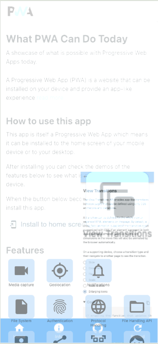
Let's have a look at the sliding transition of What PWA Can Do Today that you can find in many native apps. It looks like this:
Sliding page transition in What PWA Can Do Today
Here's part of the CSS for it:
[data-transition="slide"]::view-transition-old(root) {
  animation-name: slide-out;
}

[data-transition="slide"]::view-transition-new(root) {
  animation-name: slide-in;
  mix-blend-mode: normal;
}
The old page is represented by the ::view-transition-old(root) pseudo-element and the new page by the ::view-transition-new(root) pseudo-element. The app includes a View Transitions demo where you can select an animation for the pages which is selected by setting the animation name as a data-transition attribute on the <html> element. So for the "slide" animation, you would get:
<html data-transition="slide">and the CSS uses the [data-transition="slide"] attribute selector.
Other CSS animation properties are set on both pseudo-elements, for example:
::view-transition-new(root),
::view-transition-old(root) {
  animation-duration: 300ms;
  animation-timing-function: cubic-bezier(0.465, 0.183, 0.153, 0.946);
  animation-direction: normal;
}This will add the sliding page transitions, but when navigating back the new page would need to slide back out to the right of the screen. With the CSS in the previous example, however, all new pages will slide in from the right including pages that you navigate back to which is clearly not what we want.
The back navigation needs to be different and we can apply a different animation by setting a class on the <html> element depending on if we're navigating forward or backward.
Here's how you could do it:
// set "back-transition" class when navigating back
if(isBackNavigation()) {
  document.documentElement.classList.add('back-transition');
}

// get the new page somehow
const template = getNewPageHTML();

const transition = document.startViewTransition(async () => {
  document.body.innerHTML = template;

  try {
    // wait for the transition to finish
    await transition.finished;
  }
  catch(e) {
    console.error('error in transition:', e);
  }
  finally {
    // remove "back-transition" class
    document.documentElement.classList.remove('back-transition');
  }
});
And now we can change the transition on back navigation like this:
[data-transition="slide"].back-transition::view-transition-new(root) {
  animation-name: slide-out-reverse;
}

[data-transition="slide"].back-transition::view-transition-old(root) {
  animation-name: slide-in-reverse;
  mix-blend-mode: normal;
  z-index: 1;
}
While this works, we always need to add a class to the <html> element (or another parent) and remove it after the transition has finished. If we forget to do that, we may break the transition.
Luckily, the new spec adds a better way.
View Transition Types
With View Transition Types, you can assign one or more types to an active view transition. So instead of adding a class to <html>, we assign a type to the transition based on if we're navigating forward or backward.
That way, we don't have to modify the HTML and the type will be automatically removed when the transition has finished:
// determine the transition type
const direction = isBackNavigation() ? 'back' : 'forward';

// get the new page somehow
const template = getNewPageHTML();

document.startViewTransition({
  update: () => {
    document.body.innerHTML = template;
  },
  // set the transition type
  types: [direction]
});
document.startViewTransition now receives an object whose update property holds the function that updates the view and whose types property holds an array of transition types. When navigating forward, the forward type will be applied and on back navigation, the back type will be applied.
In our CSS, we can now use the :active-view-transition-type pseudo-class to define rules depending on the active transition type:
/* forward navigation */
html:active-view-transition-type(forward) {
  &[data-transition="slide"]::view-transition-old(root) {
    animation-name: slide-out;
  }

  &[data-transition="slide"]::view-transition-new(root) {
    animation-name: slide-in;
    mix-blend-mode: normal;
  }
}

/* back navigation */
html:active-view-transition-type(back) {
  &[data-transition="slide"]::view-transition-new(root) {
    animation-name: slide-out-reverse;
  }

  &[data-transition="slide"]::view-transition-old(root) {
    animation-name: slide-in-reverse;
    mix-blend-mode: normal;
    z-index: 1;
  }
}
The previous examples all applied to same-document View Transitions but you can also use transition types for cross-document View Transitions.
The pageswap and pagereveal events
To use transition types with cross-document View Transitions, the pageswap and pagereveal events were added to the spec.
The pageswap event is fired right before the snapshot of the old view is taken and pagereveal is fired right before the snapshot of the new view is taken. This enables you to make some last-minute changes on both pages.
For the page transitions of What PWA Can Do Today, I found I need to use pagereveal to set the correct transition type for a forward or back navigation:
window.addEventListener("pagereveal", async (e) => {
  // if a view transition is running, the "viewTransition"
  // property of the event will be "true"
  if(e.viewTransition) {
    // get the URL of the page we're navigating away
    // from using the Navigation API
    const fromURL = navigation.activation.from.url.replace(base, '');

    // if we navigate away from the homepage it's a
    // forward navigation,otherwise back
    const navigationType = fromURL === '/' ? 'forward' : 'back';

    // add the correct transition type
    e.viewTransition.types.add(navigationType);

    // scroll the home page to the top when navigating back
    if(navigationType === 'backnavigation') {
      window.scrollTo(0, 0);
    }
  }
});
We can then use the same CSS as in the previous example to customize the transitions for the old and new views but we also need to add the used transition types to the @view-transition at-rule:
@view-transition {
  navigation: auto;
  types: back, forward;
}
Making sure your pages load as fast as possible
With cross-document View Transitions we're of course dealing with full page loads whenever we navigate from one page to another so we need to make sure all pages load fast otherwise the transitions won't feel responsive.
This can be challenging when your pages don't load fast enough. I found that a good way of dealing with this is to add a Service Worker to your web app and in particular to let it serve streaming responses.
By default, the browser's HTML parser renders HTML in a streaming fashion, which means that the browser can render HTML while it downloads the page. It doesn't have to wait for the whole page to download but it can already start rendering while it's downloading.
By adding a Service Worker to your web app that uses the body property of a Response, which is a ReadableStream, you can make full HTML pages load blazing fast.
In the next edition of Modern Web Weekly, I will explain this in detail.
How to make one DOM element transition into another with View Transitions
View Transitions make it very easy to make one DOM element transition into another. This enables you to create nice transitions between a product card and the full detail page of that same product for example.
Here's another example of What PWA Can Do Today where the icon of a demo transitions into the full demo page:
Icon to demo page View Transition on What PWA Can Do Today
With View Transitions, these animations are surprisingly simple to implement. When you assign a view-transition-name to an element, a ::view-transition pseudo-element tree is created that looks like this:
::view-transition
└─ ::view-transition-group(root)
   └─ ::view-transition-image-pair(root)
      ├─ ::view-transition-old(root)
      └─ ::view-transition-new(root)
View Transition pseudo-element tree
By default, the ::view-transition-group(root) pseudo-element animates the differences in width, height and position between the old and new DOM states. If we assign the same view-transition-name to two different DOM elements, this pseudo-element will then seemlessly transition between these two elements out of the box and you can even further customize this transition if you want.
This is an incredibly powerful feature and there are only a couple of lines of CSS needed to implement it. Let's have a look.
The home page of What PWA Can Do Today currently contains 31 icons that all link to a demo page. To make the icons, transition into the demo pages they link to, we need to give the same view-transition-name to the icon and the element that holds all content on the demo page that icon links to.
I implemented this by giving each icon and the <div> that contains the content of the demo an id and then I set the same view-transition-name on both elements:
#view-transitions-demo,
#view-transitions-demo-button {
  view-transition-name: view-transitions-demo;
}
The view-transition-name CSS property can only be used once in each HTML document so that means that each icon and demo page need to get a unique view-transition-name. In this case, this results in a long list of view-transition-names which is not an optimal solution, but nevertheless the CSS itself remains very simple.
During the transitions, the footer stays in place because it has a separate view-transition-name and is in the same position in both views. But since the browser applies a fading transition by default, the footer will briefly fade in and out while the transition is running which is not what we want.
The view-transitio-name of the footer is main-footer and the browser applies this fading transition by fading out the ::view-transition-old(main-footer) pseudo-element and fading in the `::view-transition-new(main-footer) pseudo-element. This animation is applied through the animation-name property so we can easily disable the fading animation by setting this property to none:
&::view-transition-old(main-footer),
&::view-transition-new(main-footer) {
  animation-name: none;
}
Another issue I noticed is that when transitioning back, the icons that are displayed under the footer are visible through it while the transition is running:
I found that this is because the order of the pseudo-elements that are created for each ::view-transition-group is reversed when transition back.
When transitioning forward to a demo page, the ::view-transition-group for the footer is created lower in the DOM tree and therefore displays in front of the groups created for the icons:
::view-transition-group for the footer on forward navigationBut when transitioning back, the order is reversed and the ::view-transition-group for the footer is higher in the DOM tree behind the groups for the icons causing them to be displayed in front of the footer while the transition is running:
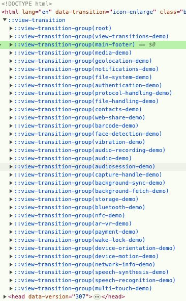
::view-transition-group for the footer on back navigationLuckily, we can easily fix this by setting a higher z-index on ::view-transition-group(main-footer) so it always displays on top of the rest:
::view-transition-group(main-footer) {
  z-index: 1;
}
This demonstrates that with just a few lines of CSS, you can create compelling page transitions. Currently, we still need to set different view-transition-names on different elements which can result in a long list, but the spec may find a good solution for this in the future.