What Offline Support For Your Web App Really Means

Modern Web Weekly #27
The greatest misconception around offline support for web apps is that it means your app should provide the exact same user experience when the app is totally offline as when the app is online.
This is false.
Users are rarely completely offline for a long time.
A far more common situation is that the user is on a flaky and/or slow connection that causes your web app to break.
Even when you're on 5G, you can experience a bad or slow connection in certain areas or circumstances.
It is for those situations that your app should provide the best possible user experience.
THAT is what offline support means and it applies to all web apps.
I say this because I often hear people say that offline support "doesn't apply" to their web app or "doesn't make sense" for it. For example, if you have a chat app you may think offline support doesn't make sense for it because you can't chat with anyone while offline.
But what if a user of your chat app is on a slow and intermittent network and loads your app or navigates to another page inside it? If this network is slow this may take a long time and when the network is completely gone the user may end up with a white screen.
If you had added a Service Worker to your chat app that would cache all JavaScript, images, CSS, and other assets locally then your app wouldn't need to fetch these anymore and the limited bandwidth of that bad connection could then be used for more important things. Your app would load and reload much faster and the user experience would be much better.
A bad connection can also cause scripts not to be loaded or requests to fail. This is what you should always try to prevent with good offline support and that's why I say providing offline support makes sense for all web apps.
There is no reason to show that "You are not connected to the internet" screen when the user refreshes the page and there's no network. Ever.
Here's how you can use a Service Worker to implement rock-solid offline support for your web app.
Assets and routes
Assets are all files that are part of your web app like JavaScript, images, CSS, and other types of files that your app uses. These can all be cached locally on the user's device so your app doesn't need to make a network request for them but instead can serve them from the local cache.
It's important to understand this is not the same as the browser's cache. This cache will also store files but the browser will always try to fetch the HTML document you request and if that fails when you're offline, it will simply show a page telling you that you're offline.
For this reason, you also need to cache all routes of your app, as I'll show later.
The assets of your app are cached in the handler for the install event of your Service Worker. Each Service Worker goes through a distinct lifecycle:
Install -> Waiting -> Activate
In the install phase, the Service Worker caches all its assets and routes using the Cache interface. While it's in this phase, it can't yet control the app so it needs to stay in this phase until all assets are cached and other needed work is done.
This is accomplished by passing a function that returns a Promise to the waitUntil() method of the install event:
// list of files to cache
const filesToCache = [
  '/src/css/styles.css',
  '/src/js/app.js',
  '/src/img/logo.png',
  ...
];

const version = 123;

self.addEventListener('install', e => {
  e.waitUntil(
    caches.open(`web-app-cache-${version}`)
    .then(cache => cache.addAll(
      filesToCache.map(file => new Request(file, {cache: 'no-cache'}))
    ))
    .catch(err => console.error('cache error', err));
  )
});
Here we open the cache named web-app-cache-123 and loop through the files listed in the filesToCache array and add them to the cache with the addAll method of cache.
As shown here, it's good practice to add a version number to the cache so you can have a new cache every time there's a new version of your Service Worker installed.
To make sure that the file you want to cache is always fetched from the network and not some older version from the browser's cache we create a new Request with the cache option set to no-cache to make sure we always get the latest version.
The Service Worker will stay in the install phase while the files are cached and only move to the waiting phase after all files are cached. If there's an error while caching, the Promise will reject, installing will fail and the Service Worker will be discarded.
If all is ok, the Service Worker will move to the waiting phase and stay there until the current Service Worker no longer controls any clients (windows or tabs) and then move to the activate phase.
In addition to assets, you may also need to cache routes to make sure these result in a response when the web app is offline.
If you have a URL like https://my-web-app.com/home you need to make sure the Service Worker can respond with an HTML document when this is requested while offline. You can do this by simply adding these routes to the URLs you want to cache:
// list of files and URLs to cache
const filesToCache = [

  // files
  '/src/css/styles.css',
  '/src/js/app.js',
  '/src/img/logo.png',
  ...

  // routes
  '/home',
  '/contact',
  ...

];
This will make your Service Worker cache the full HTML document for these routes so they will also be available while your web app is offline.
Outgoing requests
For good offline support, you also need to handle the outgoing requests that your web app makes while offline. Your app may need to update data on a server and those updates would be lost if not handled properly.
You can use a Service Worker and Background Sync to store these requests that are made by the app while it's offline and then send them when the app comes back online, like the outbox functionality of an email app.
To implement this, we can use Background Sync, which is an API that enables developers to defer tasks (in this case requests) when the app is offline and run them when the app is back online.
To make use of Background Sync, you need to request a sync request with the SyncManager which is available through ServiceWorkerRegistration.sync so you first you need to register a Service Worker and then request a sync with a unique tag:
await navigator.serviceWorker.register('/service-worker.js');

const registration = await navigator.serviceWorker.ready;

await registration.sync.register('retry-request');
Here we have requested a sync with the tag “retry-request”. Inside the Service Worker, we now register an event handler for the sync event and check the tag to identify the correct sync event:
self.addEventListener('sync', (event) => {
  if (event.tag === 'retry-request') {
    event.waitUntil(retryRequests());
  }
});
A tag is always added to a sync request so you can have multiple sync events that you can attach different functionality to.
We will now check inside the fetch handler of the Service Worker if the web app is offline and if the request needs to be stored. If this is the case, we store the request in IndexedDB and request a sync with the 'retry-request' tag. Since this is now done inside the Service Worker we will get the SyncManager object from self.registration.sync instead of registration.sync like in the previous example:
self.addEventListener('fetch', e => {
  const {request} = e;
  const {url} = request;

  if(!self.navigator.onLine && isRequestToBeStored(url)) {
    await storeRequest(request);

    return false;
  }

  // respond from cache or network
  e.respondWith(
    caches.match(request, {ignoreVary: true, ignoreSearch: true})
    .then(response => response ? response : fetch(e.request))
  )
})
Note that the function isRequestToBeStored() can be implemented however you want, depending on what requests you want to store.
The implementation of storeRequest() could be something like this:
const storeRequest = async (request) => {
  const serializedHeaders = serializeHeaders(headers);

  // save request to IDB somehow
  await saveToIndexedDB(request);

  // register sync
  if('sync' in registration) {
    await registration.sync.register(`retry-request`);
  }
};
Now when the app comes back online, the sync event handler will be invoked and the retryRequests() function will be called like you saw in one of the previous examples:
self.addEventListener('sync', (event) => {
  if (event.tag === 'retry-request') {
    event.waitUntil(retryRequests());
  }
});
Inside this function, you can now read the requests from IndexedDB, send them and then delete them from IndexedDB.
In browsers that don't support Background Sync you can use the online event of window which fires when the app comes back online after being offline. Inside the event handler you could post a message to the Service Worker to notify it that any requests that were stored when offline can now be sent:
window.addEventListener('online', () => {
  navigator.serviceWorker.controller.postMessage({type: 'retry-requests'});
});
When the Service Worker receives this message it can then execute the same functionality that it does when the sync event fires. This doesn't offer the same amount of control and granularity that Background Sync offers but is a good fallback.
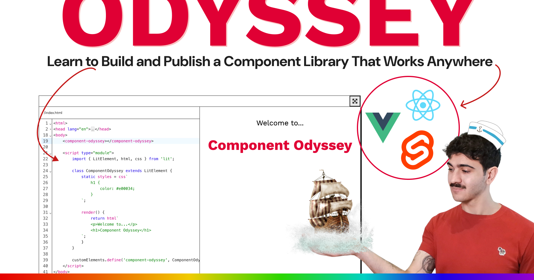
Learn to build and publish a component library that works in any web framework
The interactive Component Odyssey course will teach you everything you need to build a modern web component library. In over 60 lessons, learn how to build, style, and publish components that are interoperable with React, Vue, Svelte, and any other web framework.
Save yourself and your company weeks of development time by betting on the web and browser-native tools.
Start building components your users will love. Web Weekly readers get 10% off with the discount code MODERNWEB01.
Styling the new HTML switch
In Safari 17.5 you can now use the ::track and ::thumb pseudo elements to style an HTML switch element.
In case you missed it, you can now turn a regular checkbox into a switch by adding the switch attribute:
<input type="checkbox" switch>In Safari, you will now see this:

It supports accent-color and color-scheme but the styling options brought by these are quite limited. For example, with accent-color you can only define the color of the track when the switch is on
(input is checked). But with the new ::track and ::thumb pseudo elements you can now take the styling much further.
I had expected it would be sufficient to simply adjust the styling of the ::track and ::thumb elements but it turns out the switch requires appearance: none to completely reset its styling first. This will render it completely invisible after which the styling can be applied.
For this demo, I created a switch that has a red background when it's off and a green background when it's on:


Here's the CSS that takes care of changing the background color:
/* switch is OFF, red background color */
input[switch] {
  background-color: #ff0000;
  transition: all .3s;
}

/* switch is ON, green background color */
input[switch]:checked {
  background-color: #32d74b;
}
This will smoothly transition the background color from red to green.
Since we resetted all styling with appearance: none;, we also need to recreate the moving of the thumb when the switch is toggled with translate.
For this, we use the ::thumb pseudo element:
/* switch is OFF */
input[switch]::thumb {
  transition: all .3s;
}

/* switch is ON */
input[switch]:checked::thumb {
  translate: calc(var(--switch-width) - var(--switch-height)) 0;
}
I created a Codepen that uses CSS custom properties to easily adjust the width, height and colors of the switch. You can also adjust the time it takes for the switch to transition states and the margin of the thumb. A positive margin means the thumb is smaller than the track and a negative value means the thumb is bigger than the track:
input[switch] {
  --switch-height: 18px;
  --switch-width: 32px;
  --switch-off-color: #ff0000;
  --switch-on-color: #32d74b;
  --switch-thumb-margin: 1px;
  --switch-toggle-time: .3s;
  ...
}
Check the Codepen here (you may need to view the browser version of this email):
Enjoying Modern Web Weekly?
Consider a donation to support my work!

Anchor Positioning is now supported in Chrome 125
I already wrote about Anchor Positioning way back in Modern Web Weekly #2 when it was only experimental in Chrome Canary and I can now happily tell you it's supported by default in Chrome 125 with an improved syntax! 🎉
Anchor Positioning enables you to tether elements together in an adaptive way so you can position them relative to each other without a wrapper. You can use it to create a dropdown menu and define fallback positions for it that the browser can pick to make sure it's always displayed inside the viewport.
For example, you can create a button that, when clicked, displays a menu below it. But when the button is all the way at the bottom of the viewport and you click it, the menu would be displayed (partially) outside the viewport. You can then define a fallback position to display it above the button instead of below it.
This way, you can define multiple fallback positions to ensure the menu is always fully displayed no matter where the button is on the screen.
This is an absolute game changer as it makes it so much easier to position elements relative to each other without having to resort to complex JavaScript to ensure the anchored element is always correctly displayed inside the viewport.
Tether elements together
In the old syntax, you could declaratively define an anchor and an anchored element in HTML but this has now all been moved to CSS.
Let's say we have a button that will serve as the anchor and a menu that we want to display below it as the anchored element. To define the button as the anchor, we give it a name with the anchor-name property. This name needs to start with a double dash -- just like CSS Custom Properties. We then declare that the menu needs to be anchored to this button using the position-anchor property whose value will be the anchor-name of the anchor:
#menu-button {
  anchor-name: --menu-button;
}

#menu {
  position-anchor: --menu-button;
}
We'll also use the Popover API to display the menu as a popover which means it will always be displayed on top of everything else on the web page. The button will get a popovertarget attribute so the menu (popover) will be toggled when the button is clicked:
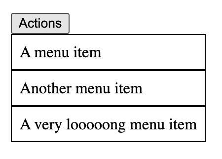
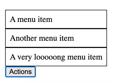
<!-- the value of popovertarget is the id of the menu-->
<button popovertarget="menu" id="menu-button">Actions</button>

<ul id="menu" popover>
  <li>A menu item</li>
  <li>Another menu item</li>
  <li>A very looooong menu item</li>
</ul>
To position the anchored element relative to the anchor, we use the CSS anchor function. This function takes one or two arguments.
If we use position-anchor to explicitly tether an element to an anchor, we only give anchor a position keyword like left, right, top, bottom or center.
For example, if we want to position the menu below the button and align it with its left side:
#menu {
  top: anchor(bottom);
  left: anchor(left);
}
This means the top of the menu is aligned with the bottom of the anchor and its left side is aligned with the left side of the anchor.
Note that normally you would need to add position: absolute to be able to position the anchored element like this but since we use popover we don't need this.
Now the menu will display below the button when it's clicked, aligned with its left side:
Now, when the button is close to the right edge of the viewport, the menu will be cut off when displayed like this:
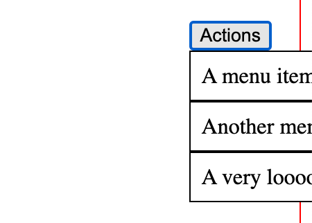
This is where the fallback positions come in. When the button is in this position, the menu should be aligned with its right edge to it's fully visible:
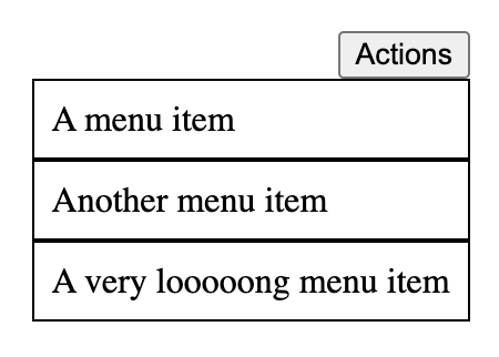
The CSS to align the menu to the bottom and the right of the button would be:
#menu {
  top: anchor(bottom);
  right: anchor(right);
}
Similarly, if the button is close to the left and the bottom of the screen, the menu would need to be displayed above the button and aligned with its left side:
And the CSS for this would be:
#menu {
  bottom: anchor(top);
  left: anchor(left);
}
To define these fallback positions that the browser can choose, we use the @position-try directive along with the position-try-options property. The fallback positions are defined with @position-try:
/* menu positioned at bottom right */
@position-try --bottom-right {
  top: anchor(bottom);
  right: anchor(right);
  left: unset;
}

/* menu positioned at top left */
@position-try --top-left {
  bottom: anchor(top);
  left: anchor(left);
  top: unset;
}
And to configure that these fallback positions should be used to position the menu we use the position-try-options property:
#menu {
  top: anchor(bottom);
  left: anchor(left);

  position-try-options: --bottom-right, --top-left;
}
The fallback positions have names that need to start with double dash -- and postition-try-options takes a list of comma-separated values consisting of one or more of these names. Now, when positioning the menu, the browser will pick the first listed position that ensures the menu is correctly displayed inside the viewport. If no position is suitable, it will pick the first one.
Positioning with inset-area
Note that in the previous examples for the fallback positions we needed to specify left: unset and top: unset. This is because the initial positioning of the menu was set with top and left but the fallback positions also used bottom and right. Whenever a fallback position is applied that doesn't use a positioning property defined in the initial positioning (in this case top and left), it needs to be reset to apply a correct positioning.
This can become error-prone but luckily, the Anchor Positioning API defines a new property for positioning, inset-area, that makes it easier to position an anchored element relative to its anchor.
inset-area enables you to position the anchored element on a 3x3 grid as shown in the image below. The image is taken from https://anchor-tool.com/ where you can play around and see how inset-area works. In the image I selectedinset-area: bottom span-right which positions the anchored element below the anchor and aligned with its left side. In a similar fashion you can use span-left, span-top, span-bottom etc.
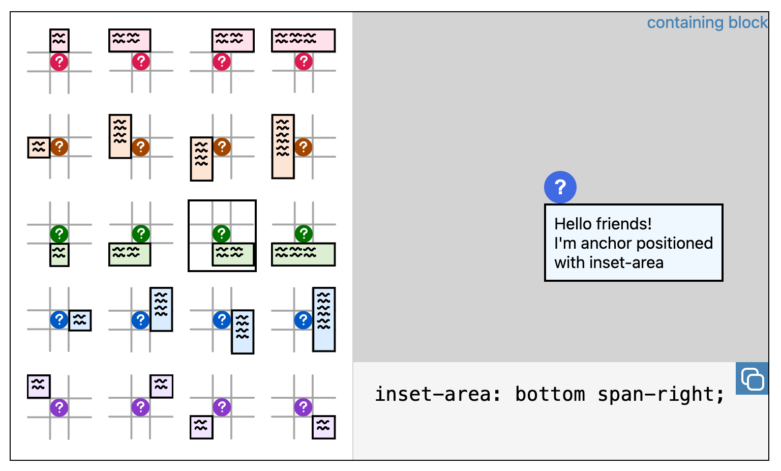
When using inset-area, you don't need to reset any CSS positioning properties anymore that are used in the initial positioning but not in a fallback position since you're now only using inset-area.
Anchor positioning is a tool we actually should have had a long time ago already but nevertheless it's an absolute game changer that makes positioning so much easier.
In the next edition of Modern Web Weekly we will dive into some other exciting features of Anchor Positioning. Stay tuned!