View Transitions Are Improved And Now In Safari

Modern Web Weekly #26
We're back with a new edition of Modern Web Weekly. Unfortunately, I had to deal with some family circumstances so you had to wait longer for this edition.
View Transitions in Safari Tech Preview
It was already listed in the feature flags list although not fully functional, but now Safari Tech Preview 192 finally ships with working View Transitions! 🎉
Version 191 already shipped with an implementation that was still a bit yanky but now the transitions are smooth, although I did notice some rough edges that need to be smoothed out.
You can check out the demo at https://whatpwacando.today/view-transitions. Make sure to enable View Transitions in "Feature Flags" in the Develop menu and then resize the window to mobile size or choose "Enter Responsive Design Mode" in the same menu.
The sliding animation that is enabled by default works fine, but if you go to the demo page and choose the "flip" animation, you will notice it's flat and doesn't show the 3D-effect. This animation uses the CSS rule transform: rotateY(180deg) to rotate the view and for this animation to have a 3D-effect, its parent element must have its CSS property perspective set.
For every View Transition, the browser constructs the following pseudo-element tree:
::view-transition
└─ ::view-transition-group(root)
   └─ ::view-transition-image-pair(root)
      ├─ ::view-transition-old(root)
      └─ ::view-transition-new(root)
View Transition pseudo-element tree
::view-transition-old and ::view-transition-new hold the old and new views respectively and for this flip animation, the new view is rotated 180 degrees around its y-axis and positioned on the back of the current (old) view. When the page is flipped, the common parent element ::view-transition-image-pair is rotated counterclockwise around its y-axis as well so the new view is revealed. When navigating back, ::view-transition-image-pair is rotated clockwise around its y-axis so the old view is visible again. It's also translated along its x-axis so we get a nice card flip effect.
To get the 3D-effect of a flipping a card, we need to set perspective: 1000px; on the parent element of ::view-transition-image-pair, which is ::view-transition-group, but it seems this doesn't work (yet) in Safari.
I also noticed that contrary to Chrome, the pseudo-element tree is not visible in the Elements tab of Web Inspector while the transition runs. Hopefully, this will be fixed soon.
You can see the issue in the screen recording below:
View Transitions improvements in level 2 public working draft
Meanwhile, the level 2 public working draft was updated to define how View Transitions should work with cross-document navigations, which means View Transitions for multi-page apps so you don't necessarily need to use a SPA anymore!
There was already an implementation of this in Chrome Canary that worked with a meta-tag to opt-in to cross-document View Transitions but in the new spec, you can opt-in entirely through CSS.
Simply add:
@view-transition {
  navigation: auto;
}
to the CSS of all documents that need to opt-in and you're in business.
Check out the demo on Glitch.
View Transition types
If you need to define transitions that are different depending on what action is taken, for example, different animations when the user navigates forward and backward, you now need to set a class on the html element and define different transitions based on the presence or absence of this class.
This means you need to detect this type of navigation with JavaScript and then set or remove that class depending on the type.
In the new spec, you can use Transition Types that only apply when the transition is running and are automatically removed when it finishes.
To use transition types, you pass an object with a types and update property to document.startViewTransition. update contains the callback function that updates the DOM and types is an array of strings containing the name(s) of the transition type(s) that should be applied.
For example, when you have different transitions for forward and back navigations:
const direction = backNavigation ? 'back-navigation' : 'forward-navigation';

document.startViewTransition({
  update: () => {
    document.body.innerHTML = '...';
  },
  types: [direction]
});
You can then define the transitions for the forward-navigation and back-navigation types with the :active-view-transition-type pseudo-class like this:
html:active-view-transition-type(forward-navigation) {

  &::view-transition-old(root) {
    animation-name: slide-out;
  }

  &::view-transition-new(root) {
    animation-name: slide-in;
  }
}

html:active-view-transition-type(back-navigation) {
  &::view-transition-new(root) {
    animation-name: slide-out-reverse;
  }

  &::view-transition-old(root) {
    animation-name: slide-in-reverse;
  }
}
Check out the demo on Glitch.
You can test this in Chrome Canary with the viewTransition API for navigations feature flag enabled: chrome://flags/#view-transition-on-navigation
How to schedule tasks in a hidden tab
If you need to schedule tasks in a loop in your web app you will probably reach for requestAnimationFrame() to schedule these. This will run at the display refresh rate of your device which is usually 60Hz which means the task will be run every 16ms.
In most (if not all) browsers, however, requestAnimationFrame is paused when the tab is hidden to preserve resources. I found this out the hard way when I was working on a screen-recording web app that writes each display frame to a canvas element using requestAnimationFrame.
When a browser tab is captured using navigator.mediaDevices.getDisplayMedia() the browser switches to that tab by default and hides the tab that contains the capturing web app. requestAnimationFrame is then no longer run and the frames are no longer written to the canvas.
It makes sense when you think of it, but this was a serious issue that rendered my screen-recording app useless. Luckily, there is a solution.
Audio Context API to the rescue
The Audio Context API can create an OscillatorNode that basically creates a tone with a certain frequency. The idea is to create this node, let it generate a tone for a time equal to the interval at which we want to schedule the task (let's say 16ms), stop it, and then run our task.
We also register an event handler to be run when it stops which is a function that starts the oscillator again, creating a loop that continuously runs our task.
This loop continues to run even when the browser tab is hidden or when the browser is minimized so it's a perfect alternative to requestAnimationFrame.
Now I just wanted you to know how this works but of course, you don't need to remember all this. Here's a simple schedule function that you can use to schedule any task at a certain interval. It takes the function you want to run and the interval you want to run it at in milliseconds:
// set this to true to stop the loop
let stopped = false;

schedule(callback, frequency = 16) {
  // Audio Context time is in seconds
  const freq = frequency / 1000;
  const context = new AudioContext();

  // create a silent Gain Node, we don't want any sound
  const silence = context.createGain();
  silence.gain.value = 0;
  silence.connect(context.destination);

  stopped = false;

  // execute is continuously run
  const execute = () => {
    const osc = context.createOscillator();

    osc.connect(silence);

    // schedule execute() to be run each time the oscillator stops
    osc.onended = execute;

    // start the oscillator and stop it after the interval time
    osc.start();
    osc.stop(context.currentTime + freq);

    // run the task, optionally pass in the current time
    callback(context.currentTime);


    // if we need to stop, remove the event handler
    // so execute() is no longer run
    if(stopped) {
      osc.onended = null;
    }
  };

  execute();
}

// usage
const myTask = function() {...};

// run myTask every 20ms
schedule(myTask, 20);
Add Declarative Shadow DOM with setHTMLUnsafe
If you've ever tried to add Declarative Shadow DOM to an element with innerHTML or insertAdjacentHTML you have noticed that the <template shadowrootmode="open"> element is not parsed and just remains to be a regular template.
With the addition of setHTMLUnsafe to Chrome 124, all modern browsers now support this API that parses shadow roots when added to an element.
setHTMLUnsafe is the unsafe counterpart of setHTML which means it doesn't sanitize the HTML string it's given. When given a string with a <template> containing a shadow root, setHTMLUnsafe will parse the <template> and add the shadow root:
document.body.setHTMLUnsafe(`<my-custom-element>
  <template shadowrootmode="open">
    <style>
      :host {
        display: block;
        color: yellow;
      }
    </style>
    Hello, <slot></slot>
  </template>
</my-custom-element>`)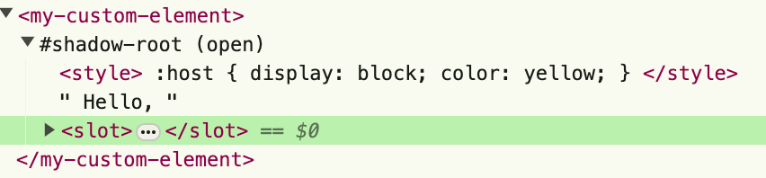
Styling file upload buttons with ::file-selector-button
File upload buttons have always been notoriously difficult to style and often developers just overlay an <input type="file"> over another button that calls the file input's click method when clicked.
I recently learned about the ::file-selector-button pseudo-element that enables you to style the file upload button, which is very simple:
input::file-selector-button {
  padding: 8px;
  border: none;
  border-radius: 8px;
  background-color: #8cc7fa;
  font-family: verdana;
  font-weight: bold;
}
Here's a codepen to play around with (you may need to view the web version for this):